Recently I have been involved in the process of designing and creating an academic poster detailing portions of my research in a manner that conveys it in a clear, meaningful way. This turns out to be very difficult task.
Poster and research writing bear many similarities. Both attempt to convey your ideas in a form that can be digested by an audience whom may or may not have the same background knowledge or skillset. Thus, conveying complex ideas through a research paper can be difficult; conveying complex ideas through a poster becomes insurmountable. [The Science of Scientific Writing](http://www.americanscientist.org/issues/feature/the-science-of- scientific-writing/1) said it best with the following:
Science is often hard to read. Most people assume that its difficulties are born out of necessity, out of the extreme complexity of scientific concepts, data and analysis.
But as they go on in the article, this isn't always the case. The major hurdle in the end is not the research itself but communicating the information to the reader. This leads me to my next point:
Academic Posters Suck
There I said it. They do. Perhaps not all of them, but definitely a large number of the posters I have run across.
Some attempt to mash what seems to be an entire paper on the same subject onto a small rectangular area. Others are aimless and seem to be splatter of charts and graphs with no coherence. But most of all, they all suffer from lack of design and lack of readability.
Design and Readability
Lack of design indicates the lack of structure and coherence in the poster and not simply the lack of aesthetics. Although the two may go hand-in-hand.
I posit that many of these problems are the consequence of trying to cram an enormous amount of information into a small area. This causes sections of text to be pushed around and consequently, different relevent sections may end up in locations that are simply not conducive to normal reading and scanning.
Additionally, even with a simple, decent design some posters still have difficultly conveying the information to the user.
Design of My Poster
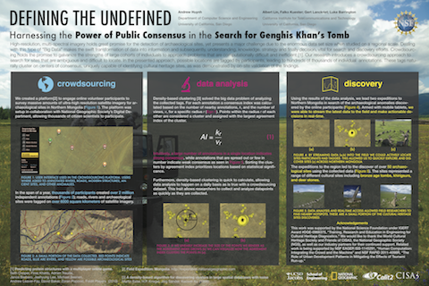
As I created my poster, I tried to take all those observations to heart. Important elements are highlighted and cruft/filler are faded out but still easily found.
Layout
Before placing any content, I sketched out an initial layout. The layout was designed to keep in mind a left to right and top to bottom reading path. Columns of information are clearly cut-out and encapsulated.
 A major problem I had with posters is the lack of structure and a clear
flow of information. My design attempts to add a bit of that to aid reading
and analysis.
Contrast
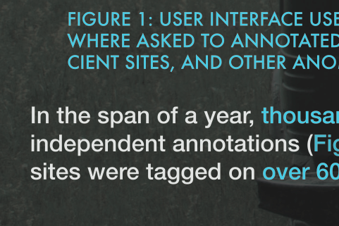
Readability is improved from normal posters by employing contrast in the correct amounts throughout the poster. The contrast shows up in the form of different colors and/or typography used to differentiate between different elements. For example, an image caption may be color highlighted with a different font in such a way that anybody skimming over the poster could easily jump over the information if needed.
 Image captions and important text are easily distinguishable from normal text.
And after all that work... the final product!


